

Best Colors for Law Firm Websites
There is no universally best law firm color. The right palette should distinguish the firm, support its positioning, and keep every important word and control easy to read.
Law firm color palettes with hex codes
All of these color directions are drawn from DGD portfolio work and shown without client names. They are starting systems, not finished brands. Color is one part of a complete law firm identity system.
See a new color direction before redesigning the site
Choose a DGD palette or customize one of your own. The Avery Legal concept keeps the strategy, layout, type, and imagery fixed so you can isolate the effect of color. If color is one part of a larger project, begin with the law firm website redesign checklist.
Adjust the four color roles below. The preview and download files update as you work.
- Body text on the light surface
- Anchor color on the light surface
- White text on the anchor color
- Text on the accent color
Harbor + Amber is selected.
Avery Legal is a fictional business-litigation boutique created for this interactive palette tool.
Business litigation / Appeals / Investigations
Business disputes. Clear decisions.
Focused counsel for companies, boards, and executives confronting disputes that can change the direction of the business.

Commercial disputesContract, ownership, and fiduciary conflicts
AppealsFocused briefing and argument when the record matters
InvestigationsIndependent fact-finding for sensitive business issues
Built for decisions that cannot drift.
Avery Legal helps leadership teams identify the real point of leverage, understand the cost of each path, and make the next decision with the business in view.
About the firmWhere the work begins
Preserve options, protect the record, and keep an urgent dispute from setting the strategy.
Early dispute counselSeparate the legal argument from the outcome the company actually needs.
Litigation strategyBuild the record and the argument with trial, appeal, and resolution in view.
Trial and appellate counselA disciplined path through uncertainty.
The site’s signature decision rail turns the firm’s working method into a visible design element.
- AssessWhat is known, what is exposed, and what cannot wait.
- DecideChoose the path that serves the legal and business objective.
- ActMove with a position the organization can explain and sustain.
The attorney shaping the strategy stays in the room.
For referral-driven matters, continuity is part of the service. The people evaluating the risk remain accountable for the recommendation.
Previewing Harbor + Amber. The layout and content stay fixed so the effect of color is easier to compare.
How to choose a law firm website color palette
A palette has to do more than look professional. It should make the firm recognizable, establish a useful hierarchy, and stay legible in every state.
Color is only one part of the larger system. The law firm website design guide explains how audience, practice type, trust, content, and technical requirements shape the whole site.
Blue remains effective because it is familiar and calm. The problem is not blue itself. The problem is using the same navy, gold, serif type, and courthouse imagery as everyone else.
- Begin with the firm’s actual position. A trial boutique, an estate-planning practice, and a regional business firm should not arrive at the same visual answer.
- Give each color one job. Use an anchor for structure, an accent for emphasis, a neutral surface for reading, and a dark ink color for body copy.
- Use less color than you think. A strong palette often feels deliberate because the accent appears rarely. Making every section colorful weakens hierarchy.
- Test the system, not isolated swatches. Check navigation, body text, links, buttons, forms, hover states, focus rings, and text placed over photography.
Five law firm color systems that avoid the generic template look
The useful lesson is not the individual color. It is how the palette supports a specific firm’s practice, location, and temperament.

Furman Kornfeld & Brennan
Burnt orange gives this New York defense firm energy and visibility. Charcoal keeps the system grounded, so the result feels confident rather than promotional.
#BF512F#5D5657#F4EEE9
Baker Manock & Jensen
Brown and green create a regional, land-based character that would make little sense for many firms but fits this one. Blue and yellow widen the system without competing for equal attention.
#6B4B36#466344#5C7F8F#C59A34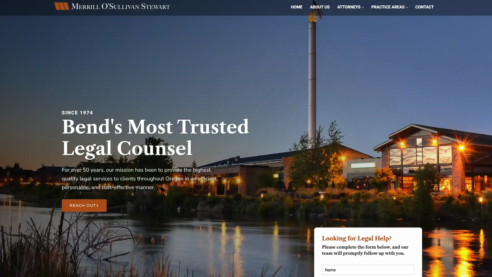
Merrill O’Sullivan Stewart
Deep slate communicates stability while orange creates a direct route to important actions. Off-white prevents the dark foundation from making the site feel heavy.
#45525A#D36B2E#F6F4EF
Sage Law Firm
A muted green family feels calm and considered for tax and business planning. Neutral gray prevents the palette from becoming overly literal or decorative.
#54705C#243A2F#E8E9E6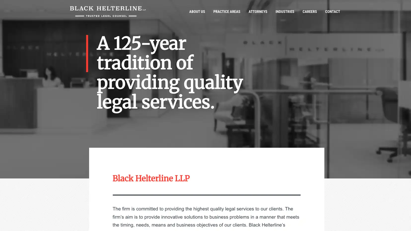
Black Helterline
Red is memorable because it is concentrated in the identity and key actions. A wide range of grays provides enough restraint for a substantial business and real-estate practice.
#B3262D#3E4143#F4F4F2Color only works when people can read and use the site
Brand colors often fail when they are turned directly into small text, links, or form controls. The solution is not to abandon the brand. It is to define darker or lighter functional versions and assign them clear roles.
Normal text
For WCAG 2.2 AA, body copy and other normal-size text generally need at least this contrast ratio.
Large text and controls
Large text and meaningful interface boundaries generally need at least this ratio. Test hover and focus states too.
Do not rely on color alone
Links should still look like links. Form errors need text, not just a red border. Selected controls need a visible shape, label, or state in addition to a color change.
Law firm website color FAQs
Is blue still a good color for a law firm?
Yes. Blue is flexible, readable, and familiar. It becomes generic only when the rest of the identity, typography, imagery, and layout repeat the same category conventions.
How many colors should a law firm website use?
Most firms need three core roles: a dark anchor, an accent, and a light neutral. Additional tints can support charts, alerts, and section variation without becoming new brand colors.
Should a call-to-action button always be red or orange?
No. Contrast and placement matter more than a supposedly universal conversion color. The button should be unmistakable within that specific page system.
Can a law firm use unusual colors?
Yes, if the palette fits the firm and remains legible. Plum, rust, forest, teal, and warm neutrals can feel credible. Novelty without a strategic reason is the risk.